Based on Switzerland’s vitality and diversity, the central idea of the multi-functional experience center is “Rich diversity and true ‘Swissness.’”
The new Mall of Switzerland is located on a piece of central Switzerland in Ebikon the size of about 10 soccer fields next to the main axis between Luzern, Zug, and Zurich. The acquisition by a subsidiary of the Abu Dhabi Investment Authority should help the project to develop into a leisure and shopping destination that goes far beyond the usual standards at existing Swiss malls. Switzerland itself provides the inspiration for the overall design theme: It stands out due to its diversity of cultures, languages, and traditions and is as varied as a kaleidoscope.
Let’s go back six decades to 1956 in Southdale, south of Minneapolis. The star architect Victor Gruen, an Austrian-Jewish emigré to America, developed the first shopping center in the world. His vision was groundbreaking: Visitors should not just find shopping, but all the functions of urban cores in one place. The design was based on naturally-evolved European city centers. Gruen saw his malls—with theaters and cultural institutions—as the center of a dense urban space, a kind of improved downtown, which was to be surrounded by dense residential areas, parks, and sports facilities. He put these ideas into practice. In addition to shops, he integrated social facilities like a library, a day care center, a theater, an auditorium, and an ice rink into “his” mall. Three years later, in Kalamazoo, an average small American city, he had two blocks closed to traffic in order to clear a space for another of his malls in the city center. Soon the next innovation followed: The Southdale Center in Minnesota was the first self-contained, air-conditioned shopping mall. This new way of shopping quickly found imitators in order to counteract the progressive urban sprawl that was pulling residential areas, workplaces, and shops far apart. Hundreds of similar shopping centers opened in the next few years in the US and consequently conquered the entire world.

A beautiful shell is not enough
In many places today, it seems as though these ideas have been forgotten. Man is a creature of habit, they say. Is this fact true of consumers, too? Many malls differ only in small ways; shopping center landscapes are marked by a lack of imagination and often appear almost sterile. Retail spaces are carelessly strung together and eventually lead to bored consumers. Centers are developed only according to the available budget while ignoring retail experiences. The result is that these centers need a facelift soon after they are opened because the revenues do not develop as desired. It is then often too late to correct structural faults, however. A beautiful shell alone is not enough.
It’s much more important to give customers a reason to come. Where is the real value for the consumer? What makes the center relevant to the visitor? The whole industry is currently mulling the answers. A top tenant profile, quality of stay, and additional services and leisure opportunities can provide the necessary incentives. A solid story, which makes the center a brand, is elementary, but still is not taken seriously. Ideally, it would create a coherent and balanced design message for the architecture, interior design, graphics, and communication and prevent long chains of errors caused when architecture is developed without regard to commercial aspects and local needs. It is necessary to create diversity and vitality, to surprise, to create places to linger, places with flashes of promise for consumers. A diversified tenant mix with a balanced ratio of core brands and individual offers also contributes to setting a center apart and breaks the monotony of the succession of shops. The interaction of various components creates a scenario in which the brand, the consumer, and the products come together. It’s about a mix of many factors, in other words. What does this mix look like at the Mall of Switzerland?
Exciting events and festivals year-round
The project developer FREO Switzerland AG, which belongs to the investment company FREO Group, gained support from retail architect Schwitzke, which has extensive shopping center experience, to develop a consistent approach. Schwitzke has already implemented innovative projects such as Pasing Arcaden in Munich, Palais Vest in Recklinghausen, and Marstall in Ludwigsburg. In times of oversupply and online shopping, the target was clear: The Mall of Switzerland must become a destination, a favorite for tenants and visitors alike. The extensive development of the theme thus began with a clear positioning of the center. “Mall of Switzerland”—the name alone already implies great promise and raises expectations. Inspired by the vitality and variety of Switzerland’s 26 Cantons, a guiding principle for the center was quickly born: rich diversity and true “Swissness.”
When the Mall of Switzerland opens in 2017, visitors can expect a multi-functional experience center that makes the area in and around Ebisquare a cultural meeting place and links it to the region. Exciting events and festivals will enliven the area all year, making it a “third place”—a space to linger that provides balance between daily work and leisure. Third places are becoming increasingly important in a globalized and interconnected world. They are among the few oases where one can disengage from permanent reachability and a strong desire for authentic experiences can be satisfied. Even the location of the Mall of Switzerland contributes to this: In the middle of touristy mountain and lake scenery and located close to the tourist destination Lucerne, the Lake Lucerne Region is geographically and historically at the heart of Switzerland. An excursion to Rigi, the “Queen of the mountains,” with her revolving cable car; a ride on the steepest cog railway in the world up Mount Pilatus; sledding pleasure at Titlis Glacier Park; and a ride on a nostalgic steamboat on Lake Lucerne are just some examples of the experiential character of this fascinating region.
Consistently imaginative storytelling and holistic marketing
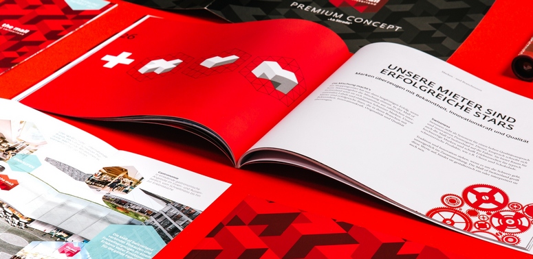
It quickly becomes clear when working on a project like this that purely aesthetic solutions are not sufficient in the sustainable development of a shopping center. Instead, consistently imaginative storytelling and holistic marketing are required. Thus, communication for the Mall of Switzerland is boosted with a whole potpourri of marketing tools to reach different audiences. A marketing brochure and design guideline bundle all the key information and facts on the Mall of Switzerland together for potential tenants. The website and an emotionally charged image film create extra interest for the project. The Mall of Switzerland’s logo was derived from the Swiss cross and reproduced to create a pattern also familiar from fashion brands. It makes a memorable impression in the space and plays with a cliché without seeming hackneyed.

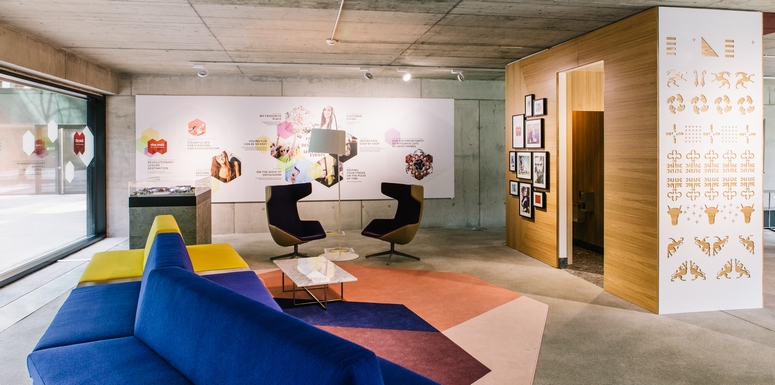
The design language at this point has developed an air of self-evidence that is easy to understand and at the same time makes a powerful statement. An elaborately designed showroom makes the look and feel of the mall tangible even before its completion and uses lots of detail to display how the overarching theme of diversity can play consistently on the design, such as with the projecting and recessed tenant façade concept. In order to avoid monotony caused by overly strict center rules, the center dispenses with a unified facade design, which is a novelty in the Swiss shopping center landscape. The result is that the Mall gives an impression similar to that of a naturally evolved downtown. This principle provides for an airy feeling of space while guaranteeing tenants a lot of room for creativity and the opportunity to lift their brands and products into the foreground with open facades and freestanding showcases. The curving mall roads also generate additional attention for brands by permitting sidelong glances and logos at a distance. Visitors obtain a personalized shopping experience, as the barrier between the store and the mall is largely eliminated.
Alluding to Swiss values
The entire interior design draws on the country’s wealth of shapes and forms and alludes to Swiss values, reinterpreted in an authentic and modern way. Original materials, such as oak and elm, terrazzo, asphalt, and quartz, establish a reference to the country’s naturalness; special emphasis was placed on the Swiss origins of the choice of materials. Traditional Swiss graphic elements derived from the 26 cantonal flags can be found, inter alia, within the modern wall pattern. Swiss landscapes are used in collages as wall elements. In short: The design concept conveys the atmosphere and feeling of life in Switzerland and asserts that the term “Swissness” is synonymous with high quality standards and an innovative, pioneering spirit. The result is a center that will leave little to be desired.
THE MALL OF SWITZERLAND’S MAIN FEATURES
- GLA: 46,000 sq m of retail space, 5,000 sq m of catering, over 10,000 sq m of leisure
- Shopping area: 140 shops, restaurants, and bars
- Recreational amenities: multiplex cinema with 2,200 seats; fitness, wellness, and spa area; indoor surfing facility
- Completion: autumn 2017
- Developer: FREO Switzerland AG
- Architecture & construction: Burckhardt + Partner AG
- Retail concept & interior design: Schwitzke & Partner GmbH
- Branding & communications: Schwitzke Graphics GmbH
- Rendition showroom: Schwitzke Project GmbH


