The EHI Retail Institute and Messe Dusseldorf bestowed the EuroShop Retail Design Awards for the 10th time on the evening of March 5. The award was presented during EuroShop, the world’s largest retail trade fair. This year, the most convincing store concepts and designs came from Primark in Madrid, Rose Biketown in Bocholt (North Rhine-Westphalia), and Saks Fifth Avenue in Toronto.
The three winners had to prevail against 80 competitors. The entries came from 27 countries. The winners met the selection criteria of the international jury if they had a clear target group and assortment message, a consistent store concept, and a good mix of architecture, materials, lighting, color, and visual merchandising that graphically communicates the store’s history.
Primark, Madrid/Spain
The concept of the fashion discounter Primark’s new flagship store stands out through its digital character, which is meant to be a direct response to the electric atmosphere of the Gran Vía. There, in a prestigious building on Madrid’s main shopping street, the store’s contemporary design extends over five floors with a total of 12,356 sq m of area.
The atrium in the center of the historic building is surrounded by 11 transparent, contiguous LED screens that interact with the store architecture and display customized visual content and special sound effects, thus creating an exceptional 3D experience for customers.
Expressive typography, illustrations, sculptures, and installations by local artists, combined with traditional materials and a color scheme tailored to the individual departments, also attract a lot of attention.
Rose Biketown, Bocholt/Germany
Omnichannel is a top priority for Rose Bikes, a German bicycle and accessory manufacturer and dealer. The online and offline worlds merge on an area of 6,000 sq m via an interactive configuration tool that invites customers to create their own dream bikes or simply browse through the product catalog on a tablet or, with the help of a sales consultant, on an interactive table.
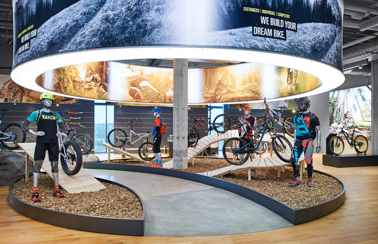
Various test stations within the store, for example for navigation systems or bike lights, help customers make purchase decisions. Individually configurable bicycles are handed over to customers at the pick-up station, where staff carefully explain the product details to the customers again.
Materials like wood and concrete, markings that suggest a road, and large landscape images give the business the right “outdoor” character. The bicycles, set impressively in scene by an illuminated ceiling construction, are presented on pedestals in the middle of the sales floor.
Saks Fifth Avenue, Toronto/Canada
The luxury department store chain Saks Fifth Avenue’s first flagship store features an impressive overall feel with exclusive artworks and natural materials. The various art installations and hand-processed materials and surfaces are inspired by natural features from Toronto and its surroundings.
Hot and cold, as well as matte and polished, materials alternate and give each department a personalized look tailored to its range.
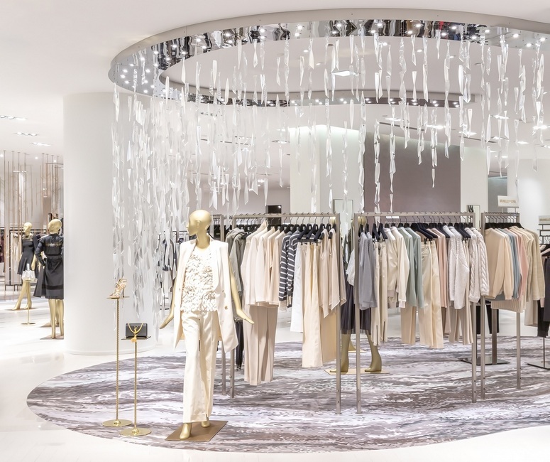
The store design, featuring stylized trees of metal and corrugated glass shards in the form of icicles on the department store’s third floor, for example, is reminiscent of the local woodlands.
The open, well-lit object emphasizes this exclusive, natural style. Services such as personal shopping consultations complement the range and offer customers additional luxury and comfort.

