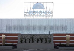
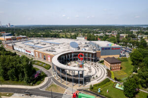
The surgery required was aimed at implementing two policy points expressed by the client. The first, the desire to establish a new image through a facade facelift that celebrated the 25th anniversary of THE ROUND Commercial Centre, on the territory. The second one. the improvement of conditions on the internal health of the interior commercial incubator space.
EXTERNAL

The operation, with a limited budget, was initiated by the redesign of the logo representing, borrowing the circle and declinanadolo both in graphics of the new plaque is in the facade textures to create holes with variable size and density on the surface you choose for coating the top of the facade.
This skin as the entire body summit that houses the administrative part, preserving healthy sight of indoors and are not deprived of natural light, while being shielded from the white cloth used to give more unity to the previous color design, made piecemeal by the chromatic alternations and small windows to view the office.
INTERIORS
Over and above the coating of glass and metal casing that frame scanning inside the local strip mall, the most significant intervention was carried out on the upper part of the gallery, where it was completely dismantled the previous time the metal, to open natural light interior spaces. Through the slats of variable section the natural light from several windows in the upper ring cover is widespread making more pleasant visual comfort of internal routes


